
Contact Us
Tel. No: +44 20 8744 2884
Email: hello@thevelvetprinciple.co.uk
When visiting somewhere for the first time, we’re likely to look at a map to plan our route. Maps help us understand the local geography and develop our own cognitive map – improving our overall ability to navigate (something that mapping apps with their turn-by-turn instructions struggle to achieve). The design can reinforce the character of a place and be used to curate the offer and visit experience.
So a decision to exclude a map is a little surprising. However, when you look at what needs to be considered and factored into the design, there is plenty of scope for things to go awry and colour the view of their effectiveness as a navigation tool.
Ultimately the challenge is to create an easy to understand diagram that enables people to identify where they are; understand the general layout; locate their destination and plot a route to where they want to go. Sounds obvious, but there are a number of elements to think about and a pretty long list of things to cover off including in no particular order:
To successfully plot a route, you need to locate where you are relative to the end point. So maps should always include an obvious ‘You Are Here’ marker.

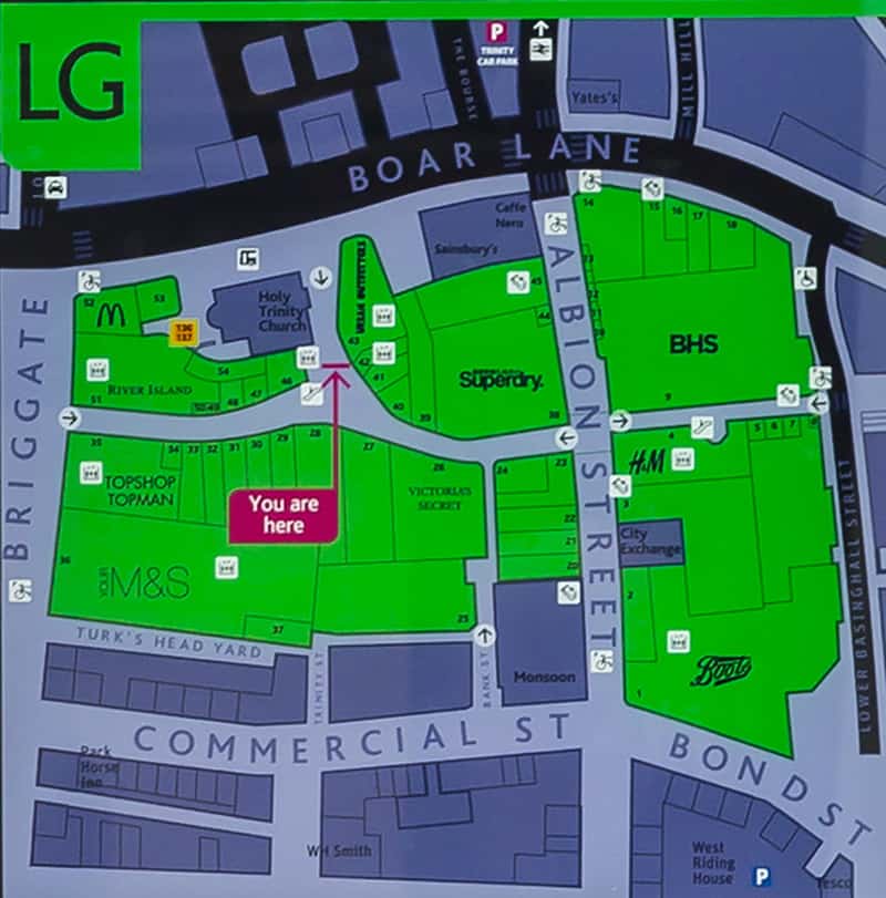
Extract from the design of the mall map for Trinity Leeds Shopping Centre
You may know the name of the place you want to go to, but you need to be able to find it on a static map. For a relatively large area such as a town centre, grid-based systems are often used to pinpoint different locations. For something more contained e.g a campus or shopping centre, individual buildings, shops or rooms may be numbered in a logical sequence on the plan. A list of destinations with their location references should accompany the map, following a logic that is easy to understand. On road maps it’s usual for street lists to be ordered alphabetically. For shopping centres the retailers may be clustered under different product categories (e.g fashion, homeware etc); within a campuses by function or activity.
We typically use landmarks to describe routes and our location. So including references to landmarks you’re likely to see on the route, will help with plotting and executing journeys. They provide useful stepping-stones and reassurance that you’re going the right way. Including representative icons in the design will be more memorable and interest to the map. But to work, the overall design needs to reflect the view you’ll see on the ground as a pedestrian. The graphics need to be scaled appropriately and not obscure other information.
When we first encounter a new map, we’ll need to familiarise ourselves with it before we can start using it with confidence. Using terms and a graphic language that visitors are likely to be familiar with, will help to shortcut this learning. When designing a map for a discrete location, it is worth researching the wider context to identify any existing wayfinding information a visitor may already have used. Analysing the graphic language and terminology used in this; and adopting some of these precedents will help ensure a smooth transition between these different environments.
Maps to assist with pedestrian wayfinding rarely exist in isolation. There is a good chance they’ll be one component in a system that includes directional prompts/finger posts and identification signs. At the risk of stating the obvious, the symbols and nomenclature used on the map need to align with those used on these other sign types (and vice versa).
If the map is being designed as part of a wider wayfinding deployment this is basic good practise and easier to control. However, within cities, towns and well-established estates, the wayfinding information may have evolved over many years. As a result there may be several different designs in evidence. With solutions that have been implemented independently, through the years in response to a particular need at that time. An audit of this content will identify precedents (and probably a few conflicts).
Judgements are needed about the volume of information to include. Too much and you won’t be able to see the wood from the trees. Not enough and you risk failing to meet basic information needs. For city/town wide schemes it’s not unusual to see a nested approach, that involves displaying two maps together. One showing detailed information about the immediate area and a second with less information but covering a larger area to provide the wider context.
For a map that needs to fit within the broader brand collateral, the challenge is to balance the drive for uniqueness, with a diagram that will be recognisable in the physical environment. Highly stylised maps can look great and help communicate the quirkiness of your brand. But take too many liberties with the relative positions, scale and distances between different features and you will impact on the legibility and ultimately the usefulness of the information.
And of course – it’s got to be heads-up. When looking at the map, the orientation needs to reflect what you see ahead of you in the physical environment. While it might be operationally easier (and cheaper) to opt for a single North-South design for all sign locations, people find it difficult to do the mental gymnastics needed to transpose the orientation so that it fits the view in front of them.
But ultimately the only real way to check whether the design is fit for purpose is to test it with volunteers that are unfamiliar with the territory and see how easy they find it to use.

Diagram illustrating ‘ Heads up Maps’ in action. Rather than a single north – south view, the diagram is oriented to reflect what a person sees in front of them.
Tel. No: +44 20 8744 2884
Email: hello@thevelvetprinciple.co.uk