Netley Residential, London: Apartment Signage Design
Brief: Naming Strategy, Wayfinding Design
Client: London Borough of Camden
Sector: Residential
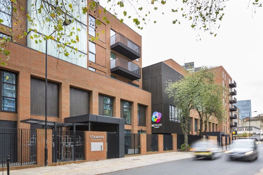
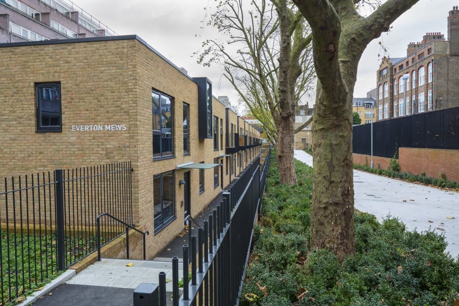
Two apartment blocks make up the residential element of this campus wayfinding project. They were built for sale, to fund the redevelopment of the primary school that shares the site.
As well as the wayfinding, the brief included naming both buildings. We wanted the names to have a direct connection with the location. So we researched the local historical, cultural and geographical context, to come up with potential candidates. These were whittled down to a shortlist and checked with council to ensure they would be accepted. Before passing the list to the school community to vote for their favourite.
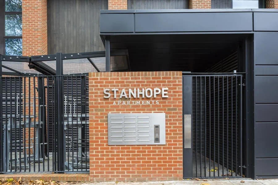
To fit within the wider campus wayfinding, a common font is used across all buildings. For the apartments the client wanted a simple, but elegant design to align with the market positioning. Reflecting the use of natural materials, the external signs are made of individual stainless steel letters. Each letter contains LED lamps to create a halo illumination effect against the brickwork. The use of stainless steel continues internally, with facility and level identification signs formed from flat sheet with stencil cut out graphics. Each apartment also has its own stainless steel number.
Contact Us
Tel. No: +44 20 8744 2884
Email: hello@thevelvetprinciple.co.uk