Solstice Apartments, Milton Keynes: Flat Signage Design
Brief: Strategy, Design & Implementation
Client: Grainger plc
Sector: Residential
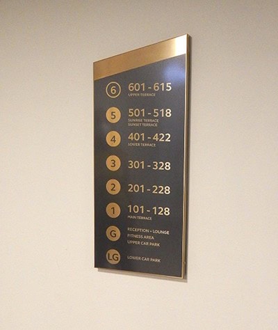
Solstice Apartments, located within the heart of the commercial centre of Milton Keynes, offers139 apartments to rent over 6 floors. So named as it purportedly sits on a ley line that aligns with sunrise on midsummer. The colours and materials used in the interior design are inspired by the summer solstice with a warm palette and reflective surfaces used throughout.
The wayfinding has an important role in welcoming prospective customers and the encouraging tenants to take advantage of all the amenities on offer.
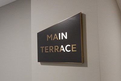
Helping them to connect with other residents and build a sense of community – all of which has been shown to increase length of tenure. The design of the wayfinding signs reflects the overall design theme. Capturing the contrast between sunlight and shade, with a warmth and glow reminiscent of summers day. The shape of the index and directional signs, provide a subtle connection to the half-mast, mono pitch design overall Grainger brand logotype. Thereby anchoring the wayfinding with the Grainger identity, building brand and the interior architecture.


Contact Us
Tel. No: +44 20 8744 2884
Email: hello@thevelvetprinciple.co.uk