Trinity Leeds: Shopping Centre Wayfinding
Brief: Wayfinding Strategy, Design & Implementation
Client: Landsec
Sector: Shopping Centres, Retail
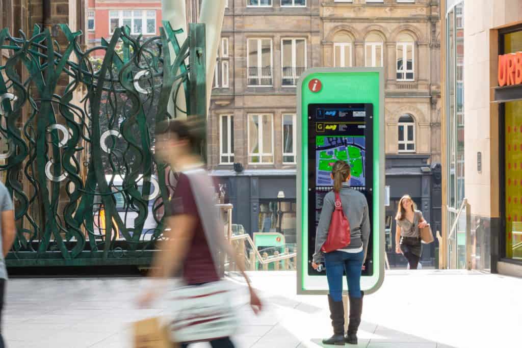
This Chapman Taylor designed shopping centre fits artfully within the existing buildings, as a seamless extension to the city streets. The development is built into a natural slope, so visitors approaching from the north enter on the first rather than ground floor. As well as solving this orientation challenge, the shopping centre wayfinding needed to align with the wider city information.
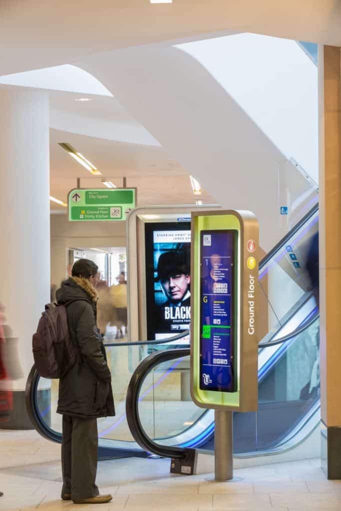
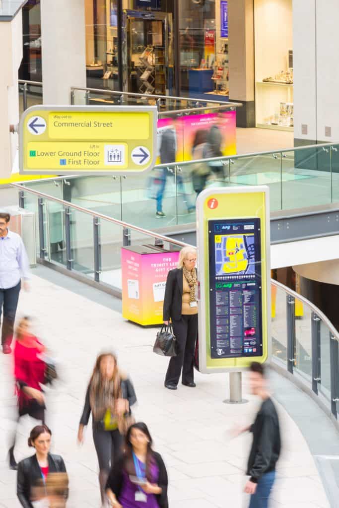
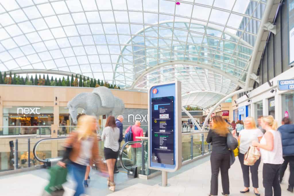
To help visitors understand what level they are on and what is above and below, the signs are colour coded. These colours, selected from the brand palette, contrast strongly with the build materials. To further ensure standout and maximise readability all the signs are lined with LED lights.
The design of the mall maps, positions the centre within the wider city and reflects the design style used within the Leeds “Walk It” scheme. As a result the shopping centre wayfinding scheme anchors Trinity Leeds within the city and ensures continuity between different environments.
Implementing the Brand
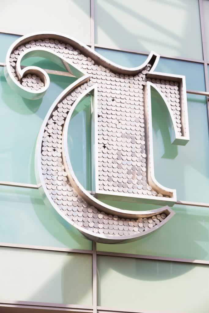
Using the brand logo as a framework, a series of external identification signs reflect the character of each entrance. The main sign features a mirror-polished framed T, lined with LED lights and filled with silver discs.
These discs shimmer in response to sunlight and wind – creating a jewel like feel to align with the glamorous fashion offer. The materials correspond with those in the destination defining public art at the entrance and within the main gallery.
For the smaller entrance off Boar Lane, dichroic film graphics were applied to the glass canopy. These change colour with the viewpoint and inject a similar dynamic feel. For the third, at the crossing point in Albion St, the limited headspace proved a particular challenge. Research identified that this was close to the site of the old Leeds Music Hall – one of the first venues outside of London to use neon lighting. In celebration, the brand logo is filled with pink neon, providing a clear connection between the two sides of the centre and the city’s cultural heritage.
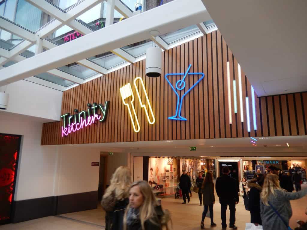
Continuing the theme, the design of the internal totems, prompts and index signs is inspired by the central spine of the T in the brand logo. The information is mounted on a clear acrylic infill, which enables shoppers to see through the signs to views beyond. This approach is extended to the design of digital advertising screens.
The outcome is a truly considered design solution that connects all elements to capture and express the brand
Contact Us
Tel. No: +44 20 8744 2884
Email: hello@thevelvetprinciple.co.uk