Trinity Kitchen, Leeds: Environmental Graphics
Brief: Identity & Environmental Graphics
Client: Landsec
Sector: Food & Beverage
Trinity Kitchen is an innovative food concept, within the Trinity Leeds shopping Centre. It offers a mix of branded restaurants alongside an eclectic mix of street food retailers trading out of vans, sheds & carts. The line-up of street food vendors is changed every month – keeping it fresh and encouraging repeat visits. The Velvet Principle worked with architects Fusion DNA, on this unique brand experience design project. Designing the identity and a series of graphics and signs that help set the stage.
As a sub-brand of Leeds Trinity Shopping Centre it is important that the Trinity Kitchen identity relates to this overall brand. It also needed to align with the design ethos of the concept – industrial grit meets urban glamour. As a result the same font is used across both identities.
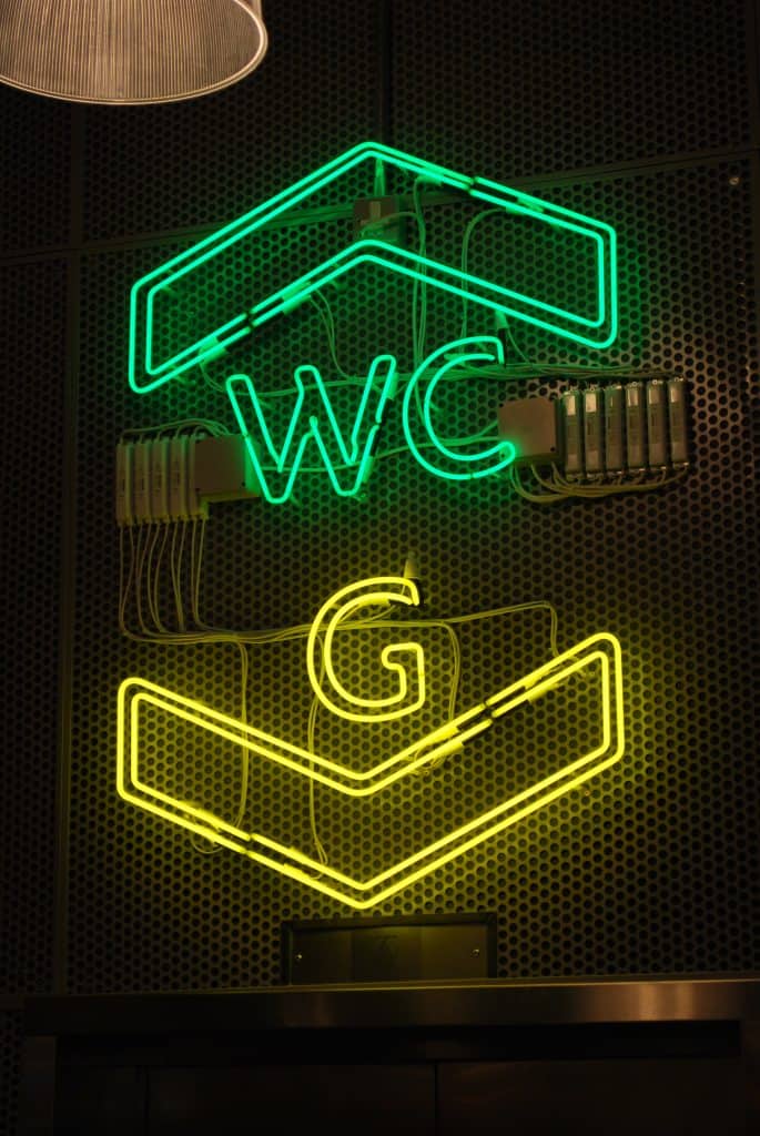
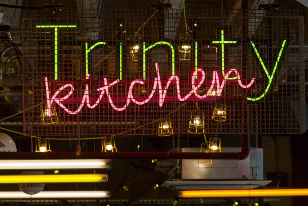
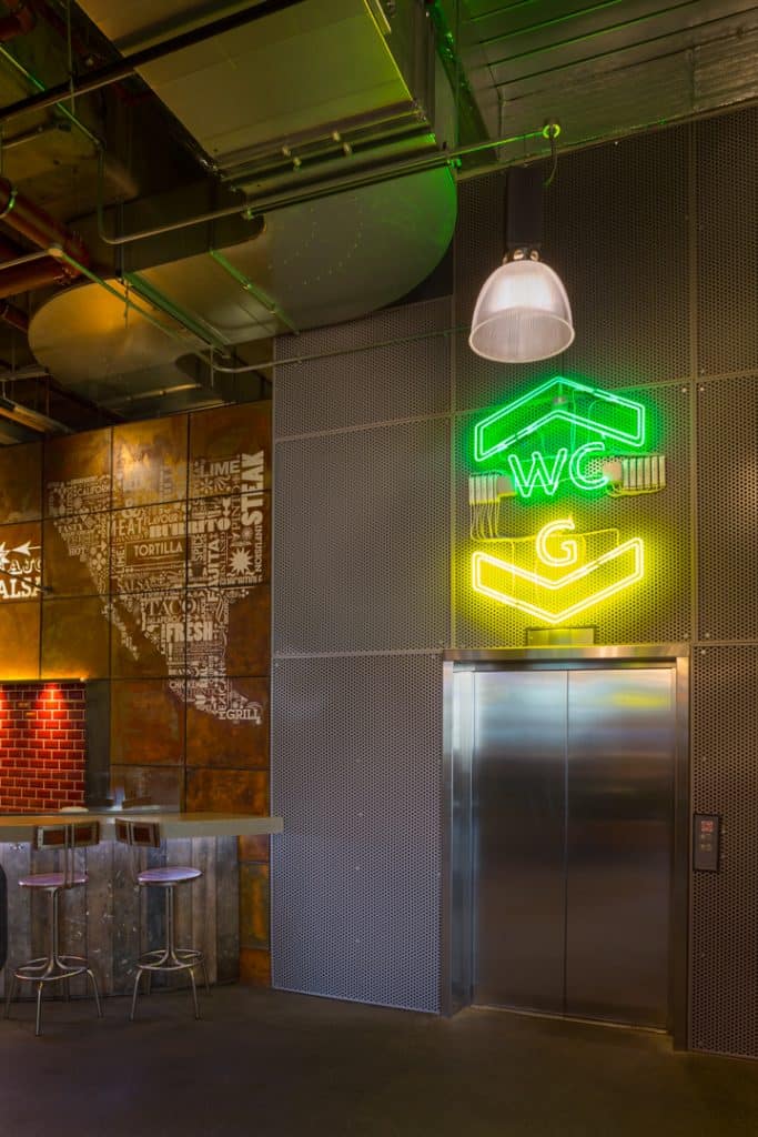
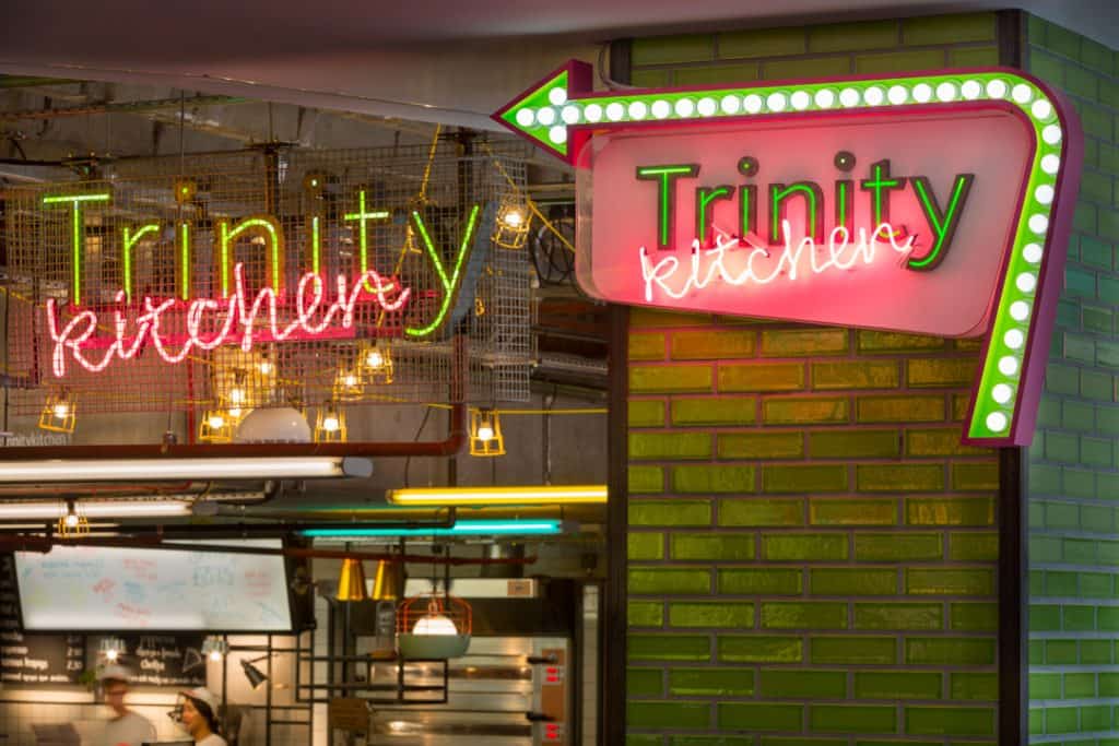
Reflecting the industrial character, the main identification signs are made from galvanised stainless steel, with embedded LED lights and pink neon script providing the glamour.
Neon is also carried through into directional signs within the dining area. The fixings of all these signs are deliberately left exposed to reinforce the industrial nature.
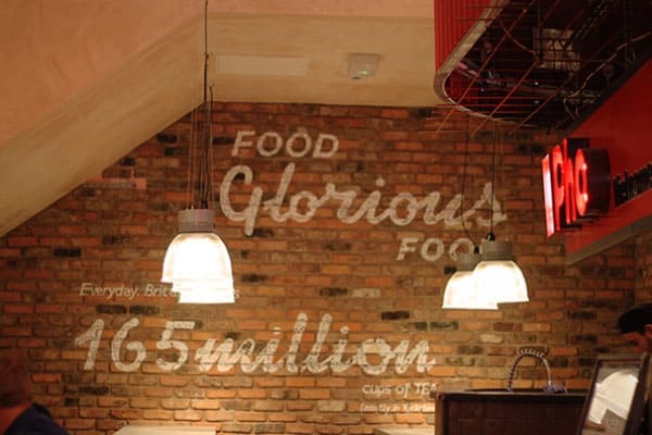
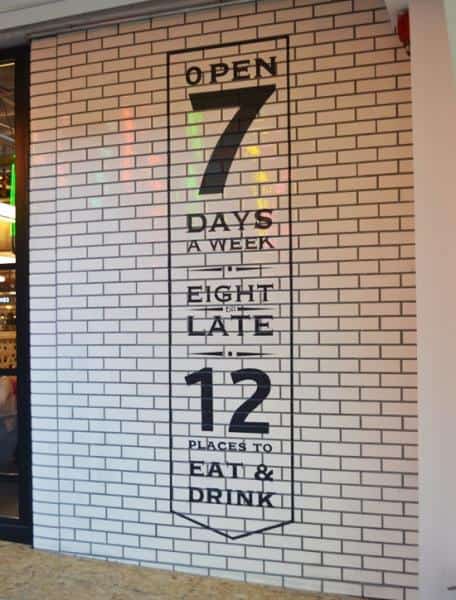
A further series of graphics using different crafted media, from ceramics through to traditional sign writing throughout are used to express the concept. The retailer directory is a marquee sign, more usually associated with cinema film listings. This allows the line up retailer to be easily and cost effectively updated to communicate the changing offer.
A combination of heavy industry materials, neon, exposed fixing and handcrafted graphics, all contribute to creating the backdrop for this unique brand experience.
Contact Us
Tel. No: +44 20 8744 2884
Email: hello@thevelvetprinciple.co.uk