
Contact Us
Tel. No: +44 20 8744 2884
Email: hello@thevelvetprinciple.co.uk

Any graphic communication concerned with wayfinding, identity or other information that is applied to a building or architectural feature. More frequently referred to as Environmental or Experiential Graphics (See Below).
Most commercial buildings will have ‘staff only’ areas or spaces where the public don’t usually go. For example the routes used to transfer deliveries from the loading bay to where they’re needed and vice versa; storage for waste and cleaning equipment; plant rooms to house all the services and electronics needed to keep a building running. These can be complex spaces, where the design has had to fit round the front of house requirements and often lacks the visual cues found with the public areas. As a result, back of house will have its own information needs. Given the operational rather than commercial focus and need for more hardwearing solutions, the finishes will differ from the front of house. So for complex buildings there is likely to be a back of house wayfinding requirement that is distinct from the front of house.
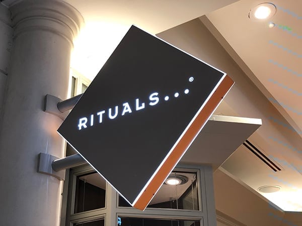
Example of a blade sign: The retailer identification sign projects at a right angle from the wall so it can be clearly seen by an approaching shopper.
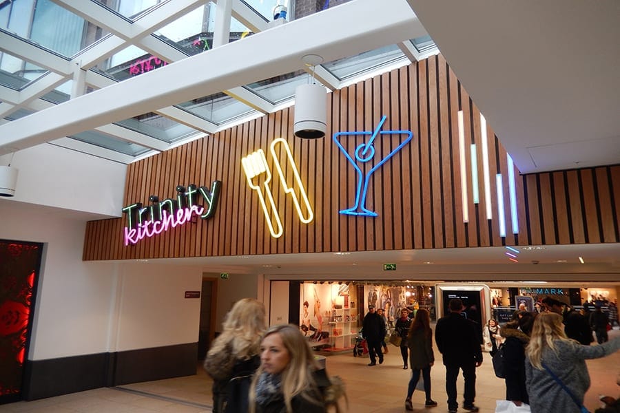
These are signs that project at right angles from a wall or pole, usually perpendicular to the flow of traffic. Typically used as projecting signs on retail facias, so that shoppers approaching along a High St or mall can spot the shop they’re looking for from a distance.
The design intent describes the target design outcome that a fabricator needs to meet. It typically marks the end of the creative design process and governs the look, feel and performance of the signs and graphic elements identified in the wayfinding strategy.
As well as including visual representations, the design intent will confirm sign dimensions, material choices, any lighting and data requirements and will specify component parts and sub-assemblies. The design intent is one of the documents that will be issued (along with the sign location, sign schedule and sign specification documents) as part of the tender package to appoint a sign contractor.
Example of a directional prompt fingerpost sign providing ‘at a glance’ guidance.
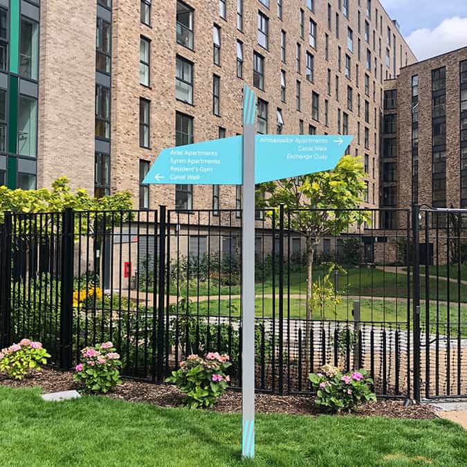
A wayfinding sign scheme is likely to include identification signs, maps & plans and directional signs. The latter are often referred as directional prompts and designed to be read at a glance. Placed at intervals along a route, they act as the breadcrumb trail to assist and provide assurance that you’re going the right way.
See Architectural Graphics – for many years Environmental Graphics was an umbrella term used to describe any graphic communication designed for and placed in the built environment. Although it is still used, increasingly it is being superseded – particularly in the US, by the term Experiential Graphics.
See Architectural Graphics and Environmental Graphics. With the increasing focus on the experience economy and potential for confusion with environmental sustainability activities, the term ‘Experiential Graphics’ has started to be used in place of Environmental Graphics. Most notably by SEGD, the US based Society for Experiential Graphic Design. In 2013 they opted to drop the word Environmental to replace it with Experiential.

Although in both instances these example of experiential or environmental graphics are imparting information, the design contributes to the overall aesthetic and helps create the background to the experience.
A type of freestanding sign form used in wayfinding schemes. Consisting of a post with a series of blade. or flag sign panels attached at the top. The content of will feature one or more destinations and is attached to the post so that the leading edge points in direction of travel.
See Blade Sign
An icon is a representative graphic symbol that has a clear visual connection with the object or thing it is seeking to represent and typically feature in maps and plans. To find out more read our post about icons, pictograms and symbols.
Identification signs can range from large branding signs applied to buildings to signs that identify room numbers and facilities
A wayfinding sign strategy will typically include identification signs, maps and plans and directional signs. Identification signs help us identify where we are so that we can plot a route to where we want to go to and are also used as confirmation that we have arrived at our destination. They range from large external branding on buildings, through to facility entrance signs (such as toilets) and flat numbers on doors in apartment blocks.
Landmarks play an important role in navigation and orientation – providing anchor points that help us to determine where we are on a map. A landmark can be anything – a statue, church, public house, village pond. It needs to be something distinctive and big enough to be seen from a reasonable distance. When visible from a long way off, they can act as beacons or reference points guiding us to a destination. We use landmarks to give context and colour to verbal directions …. turn left by the Dog & Duck, walk past the children’s playground and take the first right after the statue of Winston Churchill…..
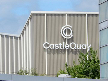
Large free standing identity signs that can be seen from a distance. Typically installed close to the front of a building or on the roadside at the entrance to a retail park for example, they tend to be targeted at drivers rather than pedestrians.
A pictogram is a graphic representation of a concept, phrase or word that can be easily understood and interpreted. They are used widely on highway signage and to communicate hazards. To find out more read our post about icons, pictograms and symbols.
See Blade Sign
The hidden structure needed to support the installation of freestanding signs. Specialist expertise is required to calculate the likely load and specify appropriate fixings to ensure that the sign won’t fail and cause injury or damage. The footing should also accommodate any power or data requirements.
These are fabricators that manufacture and install sign schemes. Although they will have engineering design capability, sign companies don’t usually offer the creative design and strategic development capability required to create and design a bespoke wayfinding scheme. A successful implementation requires close collaboration between the manufacturer and wayfinding designer.
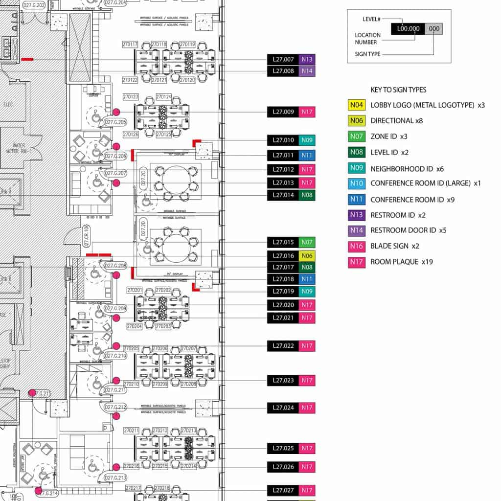
As the term suggests this is the blueprint which directs what information is needed where to help with orientation and navigation tasks. Typically ‘dots’ are marked on a map or an architects drawing. Typically the dots will be coded and a key included defining the sign type and content category.
The sign location plan, is included as part of the tender information issued to Sign Manufacturers, along with the Design Intent, Sign Schedule and Sign Specification
A plan that lists every single sign item to be installed – its location, sign type and content. This is the information that is needed to calculate the cost of the implementation. It is a key piece of information that is included as part of sign tender package.
This is a technical document that confirms the performance criteria and lists the material and manufacturing standards that the sign company will need to adhere to. This will accompany the Design Intent, Sign Location Plan and Sign Schedule in the tender pack issued to sign manufacturers.
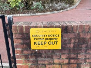
These are the signs that buildings are required to install by law e.g. fire safety, emergency evacuation, hazard warnings etc.
Large-scale graphics applied to enhance the aesthetic or add character the building or environment. Can serve a functional as well as decorative purpose.
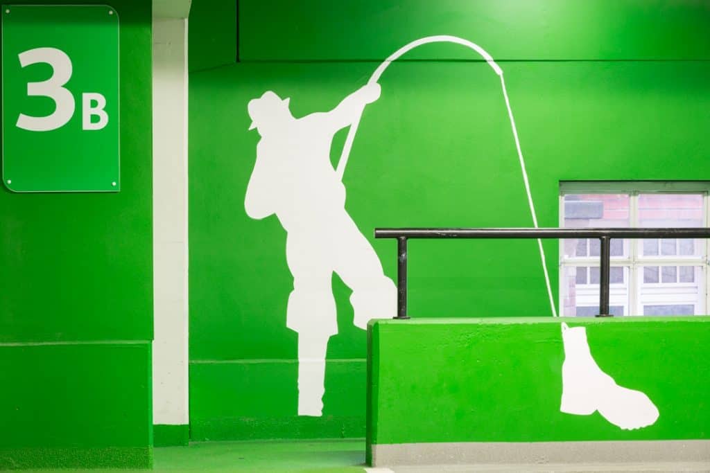
An example of a supergraphic applied to the wall of a car park. As well as providing an additional aide memoire to help returning drivers find their car it adds character to an otherwise dull environment.
Similar to icons and pictograms, symbols are a graphic representation of a concept or thing. Symbols can differ in that the meaning may not be obvious and has to be learned. The stick figures used to distinguish between male and female toilets are a case in point. A meaning has been conferred on them by society. In an increasingly global world symbols offer a common language that can be used convey complex concepts that are difficult to summarise in a single graphic or word. They are often enshrined by a formal standards body such as ISO. To find out more read our post about icons, pictograms and symbols.
A large freestanding wayfinding sign, targeted at pedestrians and could include directional information, maps or plans, lists of shops, facilities etc. Located at entrances and key decision points, these signs are there to help visitors explore what’s available to see and do and assist with plotting routes to specific destinations.
Wayfinding is concerned with the cognitive processes and tools we use in navigating the environment.
Is a specialist discipline that requires an understanding of how people navigate and the tools they use to find their way round. By analysing spaces wayfinding consultants identify where interventions are needed and select the most appropriate tool to increase its legibility. Although signs might be the most recognisable outcome, there are a range of options that a consultant may call upon from lighting, through to landscape design and even people. Most consultancies will also have the multidisciplinary design skills required to design bespoke sign forms and the content needed to fulfil the information and aesthetic requirements of the scheme
NB This is by no means comprehensive – if you come across (or use) other terms not listed – please get in info@thevelvetprinciple.com and we’ll add them to the list!
Tel. No: +44 20 8744 2884
Email: hello@thevelvetprinciple.co.uk